
Geospatial Data Quality at Scale:
Written by Aurélien Callens, PhD. Data Scientist at Sustaain
Executive Summary
Most geospatial data quality workflows answer one question: what is wrong? They rarely answer what to do about it, in which order, and why.
We built a framework that does, and applied it to approximately 330,000 geometries from several providers across 20 countries covering several EUDR commodities.
The results are clear: 35.6% of geometries carry quality issues, but less than 1% require field intervention. The majority can be fixed through automation. More importantly, the dominant errors are systemic rather than individual, pointing to pipeline and integration failures that no amount of field retraining will solve.
Data quality, managed this way, becomes a strategic lever rather than one-off cleaning task.
The Reality of Geospatial Data Quality
Each geometry was scanned for quality issues, scored along two dimensions: impact on analysis (severity) and likelihood of correction (fixability), and placed into a priority matrix that maps directly to a remediation strategy.
Our findings
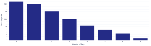
Most geometries carry 0 to 2 flags (quality issues), with a rapidly decreasing tail, but a non-negligible share accumulates multiple compounding issues.
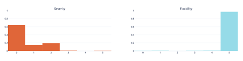
Severity is skewed toward low to moderate values, meaning most problems do not fully block analysis but still introduce bias. Fixability, however, is heavily concentrated at high values: a large proportion of detected issues can be corrected through automated or semi-automated processes.
The dominant error types are cross-feature and structural, not geometric or topological. It means that inconsistencies at the dataset level (duplicates, overlaps, encoding problems) are more prevalent than individual shape errors. The root cause is systemic data management, not isolated digitization mistakes. Improving data pipelines and integration processes will yield higher returns than focusing solely on field practices.
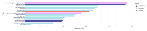
Near duplicate polygons are geometries from same supplier that overlap with >80% IoU and fake multipolygons are polygons with type MULTIPOLYGON that are in reality POLYGON
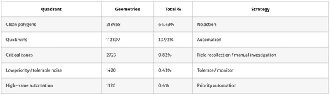
Mapped into a priority matrix, the flagged polygons (representing 35.6% of the total dataset) resolve into three actionable segments: a dominant quick wins group (easily fixable at scale), a small critical issues group (concentrating most of the risk), and a high-value automation group (where fixing yields the strongest analytical gains). This reduces a complex distribution of errors to a small number of operational decisions.

Keep learning
-

Volcafe entrusts Sustaain for their EUDR compliance portal
-

From EUDR Paperwork to One Data Model
-

Sustaain Partners with Odds for EUDR & CSRD Compliance
-

Sustainability Reporting in Commodity Supply Chains
-

Managing Traceability Risk in EUDR Compliance
-

2026 - The year nothing happens, yet everything shifts